Development of two mobile applications (class A & B) according to IEC 62304 – a field report
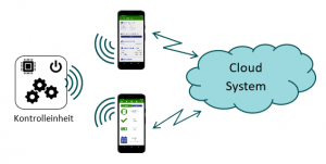
A Swiss startup in the medtech industry needed support for the development of two mobile applications for monitoring and operating a control unit which drives a mechanical implant. One application helps patients monitor the control unit and their therapy. The other application provides additional functions for doctors to analyze the progress of the therapy and adjust the configuration of the control unit. During the project, the control unit was still under development and not available for testing. Also, the higher-level customer cloud system responsible for storing and forwarding information between the individual applications was planned for a later project phase and not available for testing. However, even though the two applications had to be developed without the control unit and the cloud system, the current architecture design should still include a cost-effective method for adding these missing components and expanding the system.

Here are the challenges that we faced:
- Quick and efficient project implementation because the funding guidelines were based on a very short timeline that could not be postponed.
- Create two user-friendly mobile applications together with the customer using very few iterations which can be tested in a subsequent usability study without having a finalized requirements document at the beginning of the project.
- The control unit must be simulated in such a way as to allow the applications to be examined as realistically as possible under different scenarios in the usability study.
Project Setup & UI Design Phase

Due to the limited timeline and the iterative approach, we opted for an agile process based on Scrum with bi-weekly sprints.
At the beginning of the project, the style guides for the UI were defined together with the customer. In conjunction, the preparation of the project plan and the first draft of the architecture began. Limitations caused by the corona virus pandemic made it difficult to organize joint workshops. Therefore, everything was done via video conferences and email communications. Due to the very short timeline, it was essential to get a consensus about the applications being created and their user flows as quickly as possible to prevent the UI design from dragging on for several iterations.
Based on these style guides, the first wireframes were sketched so that the customer could get an impression of the applications. This simplified the discussions about “look and feel” and the desired functions for each application.
It was foreseeable that the two apps (doctor + patient) would have different safety classifications (IEC 62304). The additional functions of the doctor application for configuring the control unit of the implant were assigned to Class B. The patient application was assigned to Class A. The challenge in the software architecture was to clearly separate both applications and simultaneously avoid code inefficiencies. Therefore, the architecture was split into two separate codebases and the commonly used code components were linked via the so-called “assembly” to eliminate duplication of work.
Thanks to close cooperation with our customer, a user-centric UI design for the mobile applications was quickly developed.
Simulation of the missing components
As previously mentioned, the control unit was still under development and not available for testing. Therefore, the missing hardware and software components needed to be simulated in such a way as to allow the applications to be examined as realistically as possible under different scenarios in the usability study. Together with the customer, we decided to use a .NET Core Web API for control unit simulation which allowed the mobile application to be externally stimulated and monitored.
Parts of the application that will later communicate with the cloud environment come very close to the desired end product. The REST interface design allows it to be integrated and expanded in the final application. For the missing control unit, which will communicate with the application via Bluetooth Low Energy, we also created a “Simulation Web API” in the cloud with the following design:
- Instead of communicating via a BLE interface, all data exchange on the communication layer was redirected to the REST interface of the Web API using http-request.
- Higher-level layers remain unaffected by this adaptation and do not necessarily need to be modified in the final application which means that the code can be efficiently reused in later phases
To enable the customer to flexibly perform different scenarios in the usability study, a Swagger interface was used for API control. After a short training, the customer was able – even without comprehensive software skills – to independently accomplish a wide variety of scenarios.
Lessons Learned
Due to the short time frame of the project and the lack of clearly documented user requirements, a very agile and pragmatic approach had to be selected.
Although we initially focused on a good understanding of user flow and UI design, we subsequently noticed ambiguities that led to changes in the software architecture. Therefore, we switched from a common repository to separate codebases. This resulted in delays for some of the coordination and adjustments to the user interface.
In future projects, we recommend dedicating more time to the definition of the user flows, especially when the customer requirements are so vague.
But in the end, the customer still thought the project ran efficiently and with very good results:
- Thanks to an agile approach and regular customer feedback, efficient development was possible, and a partnership was formed which allowed information to be exchanged promptly.
- The simulation of components that were not yet available using a “simulation” web API in the cloud offered the customer optimal flexibility and was a complete success.
- In addition, it is possible to further develop the “Simulation API” for the next phases of the project without much additional effort during the intermediate step of creating the “Usability Study” app.
After nine weeks of intensive development, we delivered the customer two mobile applications in accordance with IEC 62304, which were then successfully tested in a usability study and allow immediate further development without major overhead.
______________________________________________________________________________
Authors:
Daniel Süpke, Business Unit Manager Software & Quality Engineering, Telephone: +41 41 799 30 10,
Philippe Suter, Senior Software Engineer, Telephone: +41 41 799 30 10,
We are here for you – send us your request!
Developing together! We put your ideas into practice and accompany your projects until they are ready for the market. Get in touch with our experts now.

